CONCEPT


“I think we’re gonna hit up JACS this afternoon.”
“What’s that?”
“Oh, just a coffee shop. Come with!”
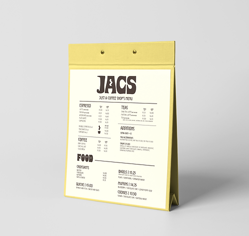
JACS is a conceptual branding project for a new coffee shop. It’s intended to be another casual and relaxed conversational spot people can go to.
I wanted to capture comfort, easygoing, and personality in the logo while maintaining simplicity. Furthermore, emphasizing that it’s “just a coffee shop” allows the consumer to make JACS their new comfort spot where they can sip and enjoy.
The target audience ranges between 18-30 years old. From a college student studying for their next exam, to young adults getting together for a cup of coffee.
JACS is just some coffee shop that holds personality yet allows any consumer to enjoy their time however they see fit.
THE MOOD BOARD
Direction: JACS is aiming to be "that spot." Super casual, somewhere that people can rely on to become the new "go-to" filled with good vibes, good people, and good coffee.
Typography: A thicker font with curves showcases personality. To avoid overcomplicating the logo, because after all - it's just a coffee shop, utilizing negative space gives it a sense of easygoing. Pairing with a thinner type that looks handwritten further emphasizes that it's human.
Colors: The color story needed to indicate simplicity, energy, and comfort. Different shades of brown are used to identify with coffee, something straightforward to match the brand identity. The yellow and blue contrast each other well. Pastel yellow communicates energy without being overbearing and the blue is comforting without sacrificing character.
Brand Words: Energizing, Easygoing, Comfort, Casual, Free-Spirited, Laid-Back, Welcoming